
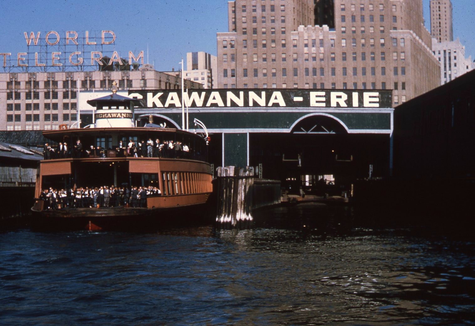
Welcome to the New York Neon Blog’s fourteenth annual roundup of lately-departed neon signs in New York City. Neon has been a hot topic here in recent weeks, with New York Magazine, the NY Post and the New York Times all running stories spurred in whole or in part by the NYC Landmarks Commission’s approval of a proposed LED retrofit for the famous NBC Studios marquees at Rockefeller Center (more on this below).
This last development prompted me to tally-up some sad statistics related to my study of these signs and their disappearance. Preservationist Theodore Grunewald asked how many of the signs featured in my book New York Neon are still around. The answer: of 157 signs featured, just 83 survive today, meaning about half have disappeared. This is more or less consistent with another sad statistic: of some 550 signs that I tracked down and photographed in New York since 2006, my notes show about 300 remaining - a little over 50 percent. For John Freeman Gill at the Times I was able to provide a still more startling statistic: of 73,539 outdoor electric signs permitted for installation in Manhattan between the years 1923 and 1955, only about 150 survive today. This means that a sign installed during that period would have a 0.2% percent chance of surviving to the year 2025. Every old neon sign in Manhattan today is something that has survived against those odds.
With this annual tally clocking in at about a dozen or more signs added to the gone-forever list every year, perhaps the most critical takeaway here is that those of us who value these signs as a part of the landscape had better make the most of every minute we've got left with them.

Apollo Theater, 253 W125th St., Harlem, Manhattan (1940)
It's especially painful when one of the city's most iconic signs turns up on this list: the instantly recognizable sign and marquee of Harlem's Apollo Theatre on 125th Street aren't going anywhere, but the theater's ownership has sought and obtained the blessing of the city's Landmarks Commission to replace their classic red neon tubing with plastic LEDs. The sign and marquee have retained their current appearance since they were installed here in place of earlier incandescent bulb signage back in 1940. The 1940 signs were replaced around 2006 as part of a thorough restoration of the theater itself. Under the Commission's watchful eye, extremely faithful facsimiles were made to replace the old signs (although the marquee's movable-type panels made way for LED screens). The Commission's sign-off on the proposed LED replacement signals a dark future for neon's place as a fixture of the streetscape. More on this below.

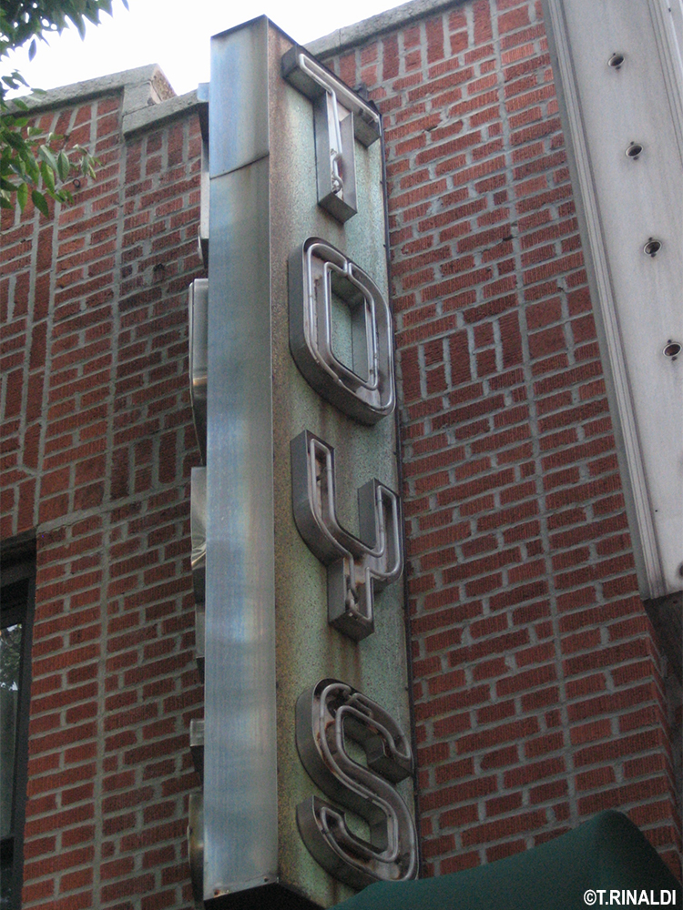
White Horse Tavern, 567 Hudson St., Greenwich Village, Manhattan (1946)
One of the more stomach-turning neon losses we've witnessed came this past May, when the famous White Horse Tavern on Hudson Street quietly took down the sign that had hung over its door since 1946 and replaced it with an LED-lit approximation. One of the oldest continuously operating bars in the city, the White Horse (or course) is known for its association with giants of the New York "beat" scene of the 1950s, the very writers whose work helped to immortalize the place of neon in the culture. The tavern sits in a designated Landmark District, so the city's Landmarks Commission is supposed to review such changes in signage, however it appears the owners went ahead with the swap-out without the Commission's approval. The Commission meanwhile appears to have willingly relinquished its enforcement duties in the matter, although it's unclear whether the agency would have objected even if it had been consulted. The LED sign appears to be the work of the same agents of neon doom that ruined the Old Homestead Steakhouse signs up the street in 2022. The old sign meanwhile is displayed like a dead animal in the bar's storefront. Its absence from the streetscape is a hole punched in the shrinking heart of the neon city.

Smith's Bar, 701 Eighth Avenue, Hell's Kitchen, Manhattan (1954)
Just before Thanksgiving, the neighborhood news site w42st.com was among a number of sources to report on the death of Smith's Bar, the erstwhile 8th Avenue dive just west of Times Square. A retail cannabis dispensary is set to take its place. Smith's was about the last remnant of midcentury storefront signage - neon or otherwise - to survive from the down-and-out Taxi Driver days of this once gritty stretch. In fact the sign scored a brief cameo in the closing credits of Martin Scorsese's landmark film of 1976. By that time, Smith's and other signs like it were already piquant vestiges of an earlier era. Records at the Buildings Department indicate a 1954 installation date for the bar's razzle-dazzle assemblage of storefront signage, which shone out from the northwesterly corner of 8th Ave and West 44th Street for 70 years before going dark earlier this year. The bar had an earlier brush with death when it closed abruptly back in 2014, but reopened early the next year under the auspices of Skip Panettiere, an ex-firefighter and father of actress Hayden Panettiere. Smith's interior has been gutted and the signs began to disappear piecemeal in December - word on the street is they've been snapped up by the New York Sign Museum.

(Photo: Nick McManus)
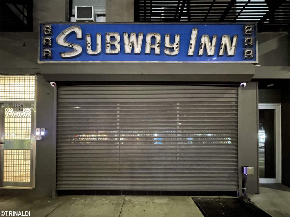
Subway Inn, 1154 Second Avenue, Upper East Side, Manhattan (1950, c. 1955)
The Subway Inn actually appeared in the 2014 edition of this series when it was displaced from its longtime home at 60th and Lex, where it had resided since 1937 (the building was later demolished, it's still an empty lot ten years later). The bar subsequently managed to transplant itself - neon and all - two blocks east to Second Ave. But old businesses, like old trees, seldom seem to survive such transplants: a few years later the bar (and its restored fascia sign, c. 1955) moved again, this time to a new storefront on the same block. This second relocation attempt seemed doomed from the start: earlier this month, the management announced the bar's closing on Facebook, citing "bureaucratic obstacles put in place by the New York State Liquor Authority" and "a shift in the way people live, work, and spend their time." They've vowed to relocate again - and to take their neon mascot with them.

The Playpen / 687 Eighth Avenue, Manhattan (c.1990)
The departure of Eighth Avenue's landmark neon nude has dealt what may be the final, fatal blow to whatever remained of the public face of Times Square grit. The sign wasn't particularly old, but it had become the ultimate standard bearer for many a sleazy landmark before it. The Playpen's neon naked lady seems to have first appeared circa 1990, when she took the place of the old changeable letter panel on the marquee of an adult movie theater known as the Playpen, near Eighth Avenue and 44th Street. About ten years later, our heroine packed her bags and moved a few doors down to crown the storefront of a sex shop at 687 Eighth Ave. (Her place on the theater marquee was taken by a neon skyline, complete with WTC silhouette.) In 2016 developers razed the Playpen Theater (an especially handsome old moviehouse that had opened as the "Ideal" back in 1915 - Shake Shack is there now). The Playpen name then followed our lovely ladyfriend down the block to 687, where both remained until earlier this year.

Loft Candies, 88 Nassau St., Lower Manhattan (c.1950s)
The saga of this sign on Nassau Street in Lower Manhattan is a story unto itself - and in fact it has been the subject of four dedicated blog posts here in years past. An important surviving circa-1950s installation for the chain candy retailer Loft's, the neon had been hidden under later signage for decades. The closing of the storefront's longtime latterday occupant - a certain Lilly's cut-rate dress emporium - dramatically revealed the older signage back in 2016. Miraculously, the storefront's next occupant - a downtown outpost of the Two Boots Pizza chain - not only announced that it would keep the old sign, but hired the experts at Let There Be Neon to refurbish and relight it. Against all the odds, the future seemed bright for this rediscovered neon landmark.
Alas, it was not to be: amid rumors of financial difficulties, the pizza joint abandoned the project a year or so later, however not before the restored sign was reinstalled here. After several more years of inactivity, a new tenant for the storefront emerged recently, but sadly the Loft's sign has finally vanished from Nassau Street once and for all. The good news is that the sign is in the safe hands of the sign shop that restored it, which reports that it may one day shine again.

J.J. Hats / "Stetson," 310 Fifth Ave., Midtown Manhattan (c. 2015)
J.J. Hat Center, on Fifth Ave. in the shadow of the Empire State Building, advertises itself as "New York's Oldest and Most Iconic Hat Shop." For a long time, it had one of Fifth Ave's most iconic signs, too, if not quite the oldest: the shop's neon herald emblazoned with the script logo of the Italian hatmaker Borsalino was a familiar site for years before it disappeared c. 2015. The sign's replacement came in the form of a handsome new neon sign for Stetson, but now this too has vanished, replaced with a garden variety, back-lit, plastic-faced fascia sign. No one is tipping their hat.

Hotel Roger Smith 501 Lexington Ave., Midtown Manhattan (c.1930s)
Back in the days of long-distance travel by train in this country, the giant sign of the Hotel Roger Smith - five stories tall - was meant to be spotted by freshly-arrived travelers emerging onto Lexington Avenue from Grand Central Terminal. A careful study of this sign revealed a slight incongruity in its lettering, the “ROGER SMITH” text being a bit more squinched than “HOTEL.” This wasn't just an optical illusion: the city's c. 1940 tax photo shows that the sign had previously been lettered to advertise the Roger Smith's predecessor, an establishment known as the Hotel Winthrop. Further digging yields that the then-growing Roger Smith chain swallowed up the Winthrop just before the 1939 World's Fair. The new management probably had the sign re-lettered shortly after the tax photo was taken. Google Streetview shows the sign still in place in 2019; it disappeared in a shroud of scaffolding soon thereafter. This year the scaffolding came down to reveal the sign gone the way of all flesh.

Towne Cafe, 1418 Ave. Z, Sheepshead Bay, Brooklyn (1954)
The Towne Cafe lay hidden in plain sight on Avenue Z in Sheepshead Bay, Brooklyn, the outer-borough neighborhood watering hole from central casting. Buildings Department records suggest a 1954 installation date for its lovely vertical sign and that sounded about right from the look of the place. Google Streetview images show it alive and well through 2019, but shuttered by 2021, an apparent victim of the pandemic. The sign hung on at least through 2022, but vanished by 2024, by which time the building was gutted and given over to a suggestively-named cannabis shop called the "Smokey Joint."

Chase Manhattan Bank, 260 Broadway, Williamsburg, Brooklyn (c.1930s)
This giant roof sign greeted riders on the elevated tracks of the BMT subway as they rolled into Brooklyn by way of the old Williamsburg Bridge. Exactly when the sign first appeared here is unclear, but the city's ever helpful tax photos show that it pre-dated the advent (in 1955) of "The Chase Manhattan Bank.” Before that, it had been lettered to advertise "The Bank of the Manhattan Company," the Chase predecessor founded by Aaron Burr back in 1799. The bank branch below the sign seems to have vacated years ago; the roof sign held on until it finally disappeared sometime between 2021 and 2022.

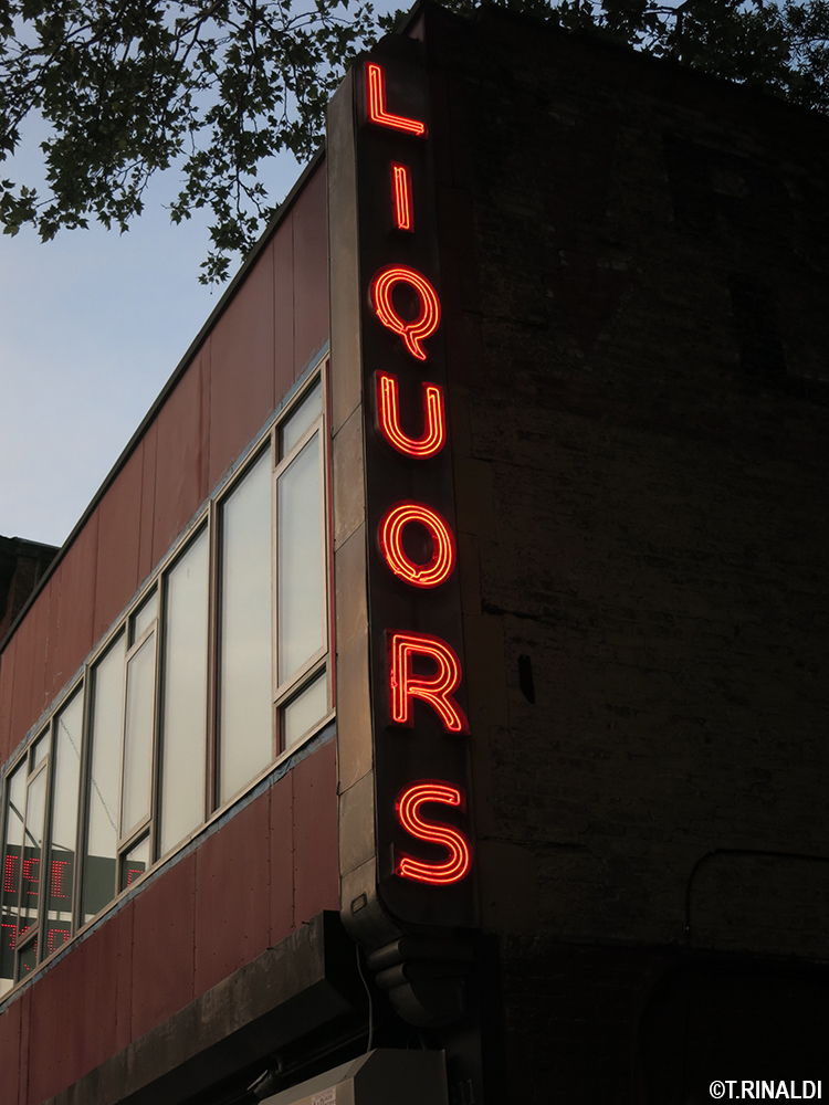
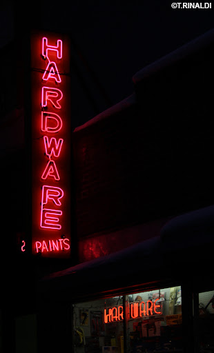
Roebling Liquors. 311 Roebling St., Williamsburg, Brooklyn (1945)
Roebling’s vertical LIQUORS sign was perhaps the earliest surviving work by the prolific Salzman Sign Co. of Brooklyn, buildings department records indicating a 1945 date for its installation here. The neighborhood liquor emporium recently moved from its longtime home on Roebling Street in Williamsburg to a smaller storefront around the corner, sadly losing its neon in the process. The Salzman Sign Co. had been founded by Nathan Salzman, an immigrant from Russia, c.1930. Salzman advertised that he’d already been in the business for fifteen years by then; his company lasted into the 1970s. Salzman’s signs can still be found all over New York, its best known work being the supremely fantastic fascia signs of Nathan’s Famous on Surf Ave. in Coney Island.
Roebling Liquors traces its establishment to 1935. Its recent move was not its first: the city’s c.1940 tax photos show it at another address two doors down from the one it just vacated, with an earlier generation of neon signage over its storefront. Its just-vanished vertical sign was originally part of a spectacular two-story neon facade that likely appeared with the business’s move to 311 Roebling circa 1945. The surviving sign featured inventive streamlined stainless steel finial and pendant details that made it particularly likable. It reportedly survives with an out of state collector.

Wu Han Restaurant, 1533 Pitkin Ave., Brownsville, Brooklyn (c. 1950)
One of the city's more stalwart neon holdouts, this especially fantastic blade sign presided over a busy stretch of Pitkin Ave. here on the Brownsville-Crown Heights border long after the disappearance of the neighborhood Chinese restaurant it advertised. Tax photos at the Municipal Archives show the Wu Han "Tea Garden" already here before WWII, holding its own with earlier neon signage on a spectacularly neon-studded thoroughfare that must have been a sight to behold by night. The Wu Han appears to have vanished by the time of the city's 1980s tax photo, but its sign held on until it finally disappeared sometime between 2021 and 2022. This was the last known surviving work of the Cornell Sign Co. of Brooklyn.

This handsome if generic vertical "RESTAURANT" sign was a midcentury classic, likely pre-dating the Chinese restaurant that operated out of the storefront below it in recent years. Google Streetview images indicate that both the sign and the restaurant made way for a residential conversion of the storefront way-on-away-back in 2015.

Kingston Lounge, 120 Kingston Ave., Crown Heights, Brooklyn (c.1945)
One of New York's best vintage storefront tableaus survived at the corner of Kingston and Bergen in Crown Heights Brooklyn, at an abandoned building that had once housed a jazz club called the Kingston Lounge. In total ruin for years, the sign and the extra-fabulous vitrolite-clad storefront below it inspired a blog calling itself “The Kingston Lounge,” dedicated to "Guerilla Preservation and Urban Archeology - Brooklyn and Beyond.” Writing of the place that had inspired him, blog founder Ian Ference reported that the Kingston had opened in 1944: “the ‘Kingston Lounge Wine & Dine Restaurant & Cocktail Lounge,’ as its falling marquee proclaims, was a neighborhood staple for decades. In the 1980s, it fell into decline ... by 2001, it was deserted. During its heyday, the Kingston attracted ... musicians as renowned as Kenny Dorham, Randy Weston, Max Roach, Sahib Shihab & Matthew Gee. In fact, Dorham, Gee, Cecil Payne and company recorded a 1960 album ... on which the second track is entitled ‘Kingston Lounge,’ in honor of the place where they practiced and jammed out, entertaining the block until the wee hours.”
In 2016 the Landmarks Commission approved a proposal that involved restoring the whole art deco storefront facade, however somehow this never came to pass. Google Streetview shows the facade stripped around 2020 and blocked from view by a plywood barricade soon after. The barricade came down this year to reveal the building beautifully restored, but with a swish historicist storefront that has nothing on its streamlined predecessor.

Hotel Caribe and the Hamilton Hgts. Hotel, 511-515 W145th St., Hamilton Heights, Manhattan (c. 1950)
The twin signs heralding this pair of uptown hotels vanished along with the businesses they advertised sometime in the past two years. Journalist Nick Garber reported for Patch back in 2022 that the “AIDS Healthcare Fdn paid $17 million to buy the two 145th St. hotels and turn them into low-income housing … AHF was drawn to the hotels because they were ‘very popular,’ with well maintained facilities, happy clients and staff, and clean buildings.” In fact Google Streetview reveals that the signs had yielded to modern LED replacements a good ten years ago, but now even the LED signs are gone.
Neon signs for hotels have held a particular niche in the popular psyche, as explored in a series of posts at this blog in years past. With the disappearance of this pair of signs on 145th Street and of the big Roger Smith sign on Lexington Ave. (see above), this leaves just the Empire and the Chelsea as Manhattan’s last hotel neon holdouts.

O'Reilly's Pub and Restaurant, 54 W31st St., Midtown, Manhattan (c.1975)
Despite its prominent location and the fantastic neon swing sign over its door, O’Reilly’s seemed somehow never to get the attention it deserved. This was the note emphasized by writer Robert Simonson in a short write-up on the place published at Eater back in 2011. “O'Reilly's has been O'Reilly's since 1975. Before that it was called Joyce's for another forty years,” he wrote: “In a region of Manhattan that changes constantly, it feels like a cornerstone as solid as nearby Keens Steak House, albeit one far less honored.” The bar’s closure at some point during the pandemic seems to have gotten lost in the shuffle of all the other bad news of that time. The sign disappeared sometime after 2022.
AND THE ONES TO WATCH NEXT YEAR

Louis Zuflacht, 154 Stanton Street, Lower East Side, Manhattan (1942)
Louis Zuflacht, a longtime Lower East Side purveyor of "Smart Clothes" at the corner of Stanton and Norfolk Streets, vanished long ago. Its neon ghost sign has lingered for decades, but now it too seems poised to vanish, as the old lowrise building above the storefront has been listed for sale as a teardown.

NBC Studios, 30 Rockefeller Center, Manhattan (c.1935)
This December, our illustrious Landmarks Preservation Commission gave its blessing to Rockefeller Center's proposal to toss the neon from the historic NBC Studios / Rainbow Room marquees at 30 Rock in favor of plastic LED replacements. No fewer than seven advocates testified at the Commission’s public hearing in hopes that the agency, which has purview over just a small handful of historic neon signs, might come to bat for this one, but the Commission voted seven-to-one to allow the change. More on this in a forthcoming post, if I can muster the strength.
POSTSCRIPT: ONE BRIGHT SPOT

(Photo: Mike Carsten)
Casa Oliveira, 98 Seventh Ave. South, Greenwich Village, Manhattan (1935, c.1950)
Casa Oliveira, longtime liquor store on Seventh Ave. in Greenwich Village, nearly made the “ones to watch” list this year. Its signs had been dark since the business shuttered about a year ago. “It has been an honor serving the WV since 1935. Our time has come to move on. Thank you to our wonderful loyal customers - you made it great,” wrote the owners in a farewell message posted on Instagram. But then last week @MCarsten shared photos (also on Instagram) showing the signs aglow again: the space now houses “Officina del Bere,” an offshoot of chefs Rita Sodi and Jody Williams’ neighboring Bar Pisellino. The new business specializes in “Italian kitchen provisions, local seasonal produce, and tools in the art of cooking.” Its storefront boasts two generations of classic neon, the older of which (as reported here back in 2011) “appeared here in 1935, just two years after the repeal of prohibition, to mark the spot of a liquor store run by one A. Rossano ... The store's porcelain enamel fascia sign came later, probably around 1950, when the business was taken over by a certain Mr. Oliveira.” Tanti auguri to the new enterprise.
NOTES AND ACKNOWLEDGEMENTS
The dates provided above are meant to indicate the year of the respective sign's installation; where precise years are given without being qualified with a "c.," the information is usually based on DOB records. Thanks to Mike Carsten, Dave Barnett, Jeff Friedman, Wayne Heller and others for their help with this post.


