Thursday, June 27, 2013

Stonewall Neon, Then and Now

One of my favorite signs that I never saw was the big neon hulk that formerly hung over the Stonewall Inn at 58 Christopher Street in Greenwich Village.  It appears in the backdrop of photos showing the Stonewall Uprising, which took place 44 years ago today (June 28, 2013).

  
The sign is gone now.  But I was reminded yesterday that Stonewall still has some neon, and a respectable sign at that.

 (T. Rinaldi)


Congratulations to Edie Windsor and hats off to what is likely to be the most photographed neon in town this weekend.  

(Diana Davies / NYPL)

(T. Rinaldi)

Thursday, June 20, 2013

St. Regis Cab Call


Not quite neon, but still of interest, I hope.

So I'm walking down East 55th Street, just minding my own business, when an odd bit of commercial archeology caught my eye. Fifth Avenue in midtown is just about the last place on earth one might expect to run across such a relic, but there hanging over the awning of the super-swish St. Regis Hotel was something I'd never seen before.

 
St. Regis Cab Call. (T. Rinaldi)

Thankfully, the lettering on the sign offers a clue to its raison d'etre:  "ST. REGIS CAB CALL," it says.  Otherwise, frankly, I wouldn’t know what the hell to make of it. The three incandescent digital panels below, it would seem, could be set to indicate any number up to nine-hundred ninety-nine. 

Not long after spotting this, I began to notice other signs like it in old photographs of the New York City streets.  Apparently, cab call signs were once fairly common, found at places like the old Metropolitan Opera on Broadway, or the Plaza Hotel – basically, anywhere you'd expect to find cabs lined up. 

 
Met Opera Cab Call, c. 1905.  (Shorpy / Detroit Publishing Co. / Lib. of Congress)

Today the cab call signs seem all to have vanished, with this one exception.  Sort of remarkably, the St. Regis keeps the sign in working condition: the numbers are set to read zero-zero-zero now, making this perhaps the very last authentic, functional, exposed bulb sign of its type in the city. 

 
Plaza Hotel Cab Call, 1912. (Shorpy / Detroit Publishing Co. / Lib. of Congress)

The mystery, though, is this: so how did it work?  Were the numbers supposed to indicate how many fares were lined up under the awning?  Would this really require a three-digit number?  Or was there some other secret code going on? 

 
Saks Fifth Ave Cab Call. (MCNY)


Liberty Theatre Cab Call. (Buena Vista University)

Alas, no one at the St. Regis seems to know, so the secret of the St. Regis Cab Call remains the domain of Midtown past.

IN OTHER NEON NEWS: 
Riverside Liquors on the Upper West Side is moving - and they're taking their sign with them.
• Mystery neon brought to you by the MCNY.
• Check out Kirsten Hively's neon photos at Cafe Grumpy in Greenpoint, Brooklyn.

UPCOMING NYNEON TALKS:
• July 22, 2013, at the NYPL / Mid-Manhattan Branch.

Thursday, June 13, 2013

Circo's Pastry Shop

There was something particularly vexing about the sight of Circo's handsome old signs un-lit.  I had really, really hoped to include this venerable Bushwick pasticerria in the neon book. In the end I had to make do with daytime shots of darkened, snow-covered signs.

Circo's Pastry Shop, at 312 Knickerbocker Ave. in Bushwick, Brooklyn, pre-restoration.  (T. Rinaldi) 

Then, not long ago, I heard from Robbie Ingui of Artistic Neon that the fine folks at Circo's had hired him to bring the signs back to life. In terms of restoration, I often liken old neon signs to old cars. Sometimes, a little spit and polish is all you need.  Other times, a sign has reached a point where it needs to be restored from the ground-up.

Nice work if you can get it: making patterns for replacement tubes. Robbie Ingui assited by Greg Lowe. (T. Rinaldi)

At Circo's, Robbie found the signs in fairly decent shape. Their 60-year old enameled sheet metal had been painted over, stainless steel channel letters lost their sheen, and the framework holding it all together had corroded somewhat over the years. But Robbie was able to get the signs re-lit without a full removal and reassembly, thanks partly to a crawlspace over the shop's ceiling that provided access to components in back.

Robbie and Greg using plexiglas to trace the original channel letters.  (T. Rinaldi) 

The neon tubes on the other hand hadn't fared so well. After 60 years, electrodes had failed, fluorescent coatings worn out, sockets had grown brittle and some tubes were cracked and broken. Rather than saw-off and replace each failed electrode and then re-pump gas into the tubes, Robbie fabricated a complete new set of glass letters to match the originals.

New tubes were bent to match patterns made from the originals. (T. Rinaldi) 

Neon tube benders today employ the same basic materials and techniques that prevailed when Circo's first installed these signs sixty years ago.  The replacement tubes match their predecessors not just in size and color, but in almost every detail of their fabrication.  Even by the standards of architectural restoration, where fiberglass sometimes substitutes for terracotta, this is in-kind replacement to the utmost extreme.

Cork separators and copper wire keep the tubes in position, just as they did on the originals. (T. Rinaldi) 

Back in the shop, Robbie demonstrates tracing, bending and splicing the new tubes. (T. Rinaldi)

Old neon signs and good Italian pastries seem to go hand in hand. To wit: Veniero's and DeRobertis on Manhattan's East Side, D'Aiuto's on the West Side, Egidio's up in the Bronx, Rispoli's in Bensonhurst (my family's old go-to, now gone), and of course Circo's. In my experience, Italian pastries just don't taste as good if they haven't come out of an old, neon-crowned storefront.

Of stainless steel and sfogliatelle: Circo's exudes authenticity in every detail. (T. Rinaldi) 

Circo's has all the accoutrements of those classic, family-owned pasty shops that vouch for the authenticity of the goods within.  From its gleaming stainless steel window frames to its terrazzo floor to the neon over the storefront, it's all there and in great clip, too.  In their book Store Front, photographers James and Karla Murray tell us that Circo's has been up and running at its current location since 1945. The business originally opened at another storefront down the block two years earlier.  In 1970, old Mr. Circo sold the business to Nino Pierdipino, whose sons Salvatore and Anthony run the business today.  DOB records date the signs to 1953, making them 60 years old in 2013. 

Robbie fits electrodes and fires up one of the replacement tubes. (T. Rinaldi) 

Recently, when the Pierdipinos decided to do some sprucing up, they actually considered scrapping the neon and going LED.  Happily, they decided to repair the signs instead, starting with the horizontal fascia signs (the vertical DOLCERIA sign may come later).  Artistic Neon, the shop Circo's contracted to do the job, is located just across the Brooklyn-Queens border in Ridgewood.  Like Circo's, Artistic Neon is a multi-generational, family-owned, Italian-American business, having got its start 40 years ago by Gasper Ingui.  Gasper began as a tube bender in the early 1950s.  Later, he passed his skills along to Robbie, his son, who runs the business today.

Robbie will also refurbish Circo's window signs. (T. Rinaldi) 

Last week, having cleaned up the sheet metal and re-painted the metal backings within the channel letters, Robbie set about installing the new glass letters with the help of Greg Lowe, who he had enlisted to assist with the Circo repairs.  The job took most of the day.  Then, a little before 4pm, Circo's came unceremoniously back to light.  The sign glows now as well as it ever did, but it still bears some of that patina that befits a fine old storefront like this.  Inasmuch as a sign's job is to draw attention, nothing does the job like an old neon storefront today.  Circo's old sign isn't just the brightest thing on the block: it marks this as a business that has stood the test of time.  There is nothing like it anywhere on this stretch of Knickerbocker Avenue today.  Maybe it's just me, but I swear I can taste the difference.


Back in business: Circo's neon turning heads just hours after installation.  (T. Rinaldi)

MANY THANKS to Sal Pierdipino, Robbie Ingui, Greg Lowe and Ellen Barton for their help and moral support.

IN OTHER NEON NEWS: 
• As forecast, Macy's old reverse-channel beauties at 34th and Seventh are gone, as is Tad's Steaks c. 1960 signage across the street.
• Last chance to pick up some old Williamsburg shoe store neon!  Contact me for details.  
• Some very, very stimulating historic photos of So-Cal neon in its prime, via Gizmodo and the Southern California Edison Archive.  (Scroll down - thanks to Emilie Evans for this link.)
• Ghost signage (not neon) on 14th Street, the via Ephemeral NY blog.
 A photographic tribute to some Albany (NY) neon, at the former Olympic Bar and Restaurant, by way of Chuck Miller, the Albany Times-Union, and the Society for Commercial Archeology.
 Enjoy the neon paintings of Kathryn Siegler (Thanks to Paul Shaw for the link).  

UPCOMING NYNEON TALKS:

• June 19, 2013, for the Lower East Side Preservation Initiative at the Neighborhood Preservation Center.
• July 22, 2013, at the NYPL / Mid-Manhattan Branch.

Thursday, June 6, 2013

Letters From Neon: Serifs and Sans-


As a child of the '80s, I grew up with a certain indistinct disgust for Helvetica.  I had no idea that it had a name.  The word "font" had yet to work its way into the popular lexicon.  I just knew that those letters were EVERYWHERE to such an extent that almost any other letterform seemed more appealing by comparison.


Corporate Helvetica.  (Thomas J. Quinn)


Come to find, I was not alone.  The coming-of-age of a new graphically-conscious generation has seen bit of a backlash against the tyranny of Helvetica.  This, I realized only when I began writing the neon book, is a big part of the the widespread enthusiasm for old signs (neon and otherwise) today.  


The post-Helvetica generation at work: anything but Helvetica on this recent Netflix packaging.

"Neonline Block."  Historically, signpainters could source letterforms like these from books such as Alf Becker's "100 Alphabets," published in 1941.  (NYPL)

Old neon signs almost never use anything that looks like Hevetica.  In fact, as I learned, they don't really use typefaces at all.  At an early stage in writing the neon book, I made an ill-conceived attempt to describe certain signs in terms of "typefaces" or fonts.  As type designer Paul Shaw told me over beers one evening at the Dublin House bar, the letterforms found on these old signs are often unique designs created by sign painters on a case-by-case basis.  "These guys were sign painters," he told me: "give them the credit they're due." 


Eight old neon bar signs found around NYC.  Not one features the standard, triangular "A".  The round-topped "A" is an icon of classic neon typography.  (T. Rinaldi)

The individuality of design found among old signs is heightened because big corporate retailers and chain stores never let their signs get old. Thus, signs that survive more than a few years usually belong to independent businesses whose old signs - and pre-Helvetica letterforms - are truly one of a kind.  Though old neon signs are seldom discussed in terms of type design, I have come to the conviction that lettering is an essential part of their appeal.  Feast your eyes, then, on some favorite letterforms from the signs I found in my ongoing survey of New York's surviving pre-Helvetica neon.


Classic, round-topped "A"s are the least of it at the Papaya King (179 East 86th St., Manhattan, made 1964 by the LaSalle Sign Corp).  Check out those "P"s and "Y"s, too!  That "K" ain't bad either...


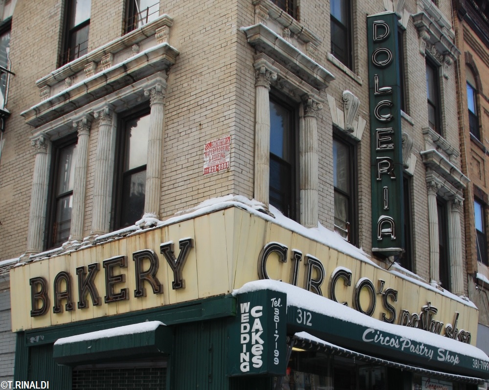
At Circo's Pasticceria (312 Knickerbocker Ave., Brooklyn, made c. 1953), we find the classic round-topped "A" with slab serifs, no less...


More round-topped "A"s at Nathan's Famous (1310 Surf Ave., Bkln, made c. 1960 by the Salzman Sign Co.) - witness, too, the signpainter's stretched-and-skewed letterforms, seen also at:


Capitol Tackle (132 W36th St., Manhattan, made c. 1941 probably by City Wide Neon), and at: 


...Rudy's Bar and Grill (627 9th Ave., made 1937 - note the nice chamfering happening here, too), and formerly at:


The Collins' Bar (735 8th Ave., Manhattan, made c. 1930) - dig that chamfering, too!


Frank's Fish Market (formerly at 4230 Broadway, Manhattan, made 1949) had all the elements of classic neon streamlining - round-topped "A" and "M", "C"-shaped "E", lovely arced legs on "R"s and "K"s, and - my favorite, the lower-case "N" promoted to a capital, used to great effect at:


...Broadway Wines & Liquors (38-09 Broadway, Astoria, Queens, made c. 1945 - delight also in the cup-bottomed "W", "3"-shaped "E", and deco thick-and-thin action).  


Another lower-case N at Waverly Wines & Liquors (formerly at 135 Waverly Place, Manhattan, made c. 1955).  But wait, there's more, at:


M&M Pharmacy (1901 Avenue M, Brooklyn, made c. 1945).  Let's pause here to admire some of my absolute favorite lettering anywhere in NYC: 


The lower-case "N" appeared also at the Cheyenne Diner:


Formerly at 411 Ninth Ave. - this one actually seems to have been drawn-up sometime in the mid-1980s, a very good riff on letterforms of old.  Cheyenne has decamped, but one can still admire the lower-case-upper-case N at: 

...Smith's Bar & Grill (701 Eighth Ave., Manhattan, made 1954 by Da-Nite Neon).  Let's use this one to segue to another favorite - can you guess?

It's also seen here, at the former Austin Theatre - now the Kew Gardens Cinema (8105 Lefferts Blvd., Kew Gardens, Queens, made c. 1935) - I refer of course to the slinky "S", that we find also at:

...Seward Park Liquors (398 Grand St., Manhattan, made c. 1960) - and, at:

...Catania's Shoes (3015 Westchester Ave., in the Bronx, made c. 1945 by Globe Neon).  Let's take a moment to admire them in detail: 


A rather different "S", no less likable, we find at:

...Fuller's Drugs (2688 3rd Ave., Bronx, made c. 1957).

Changing gears a bit, let's segue toward some lower-case love, starting with:

...Louis Zuflacht, a long-vanished Lower East Side purveyor of "Smart Clothes" (154 Stanton Street, Manhattan, made 1942).  Gorgeous letters from curly-topped "L" to slanty-cross-barred lower-case "t" - oh, but wait...

Here, perhaps, the ne-plus-ultra of New York's neon letterforms, at the Village Vanguard (178 Seventh Ave. South, Manhattan, made c. 1949).  A replica of the original sign - whoever made this did a superb job reproducing the original letters.  That "d"!  That "r"!  That "n"!  Those "a"s!  And oh, that "g," maybe my favorite letter in town.

Some rather boxy, very midcentury lower-casers, at the Palomba Academy of Music (974 East Gun Hill Road, Bronx, made 1956 by the Grauer Sign Co.).  These letters appear to have cousins, at:

Goldberger's Pharmacy (1200 First Ave., Manhattan, made c. 1960).  

Going back to caps-lock, but staying with the boxy theme, behold:

Ganin Tires (formerly at 2360 Flatbush Ave., Brooklyn, made c. 1960), and these:

...at Midtown's self-proclaimed Famous Oyster Bar (842 Seventh Ave., made c. 1960).  Then we find these bolder versions at:

Rose Wine and Liquors (450 Columbus Ave., Manhattan, made c. 1954 by Midtown Neon).  By way of a little contrast, let's admire:

...these Futura-ish letterforms, formerly at JL Wine and Liquor (formerly Goldrich Wine, at 60 E34th Street, Manhattan, made 1950).  Alas, these have recently yielded to LED replacements.  Happily, we still have these:

...at the beloved Block Drugs (101 Second Ave., Manhattan, made in 1945).  If Block's geometric sans-serifs don't sufficiently suit your taste for the pre-Helvetica, try these on for size:

Very rare surviving pre-War thick-and-thins, at the Boulevard Tavern (575 Meeker Ave., Brooklyn, made c. 1935) - please, someone re-light this!!  And then there was this:

The late, lamented Lenox Lounge (formerly at 961 Lenox Ave., made c. 1945).  

In a slightly different vein...

I like to call these letters "brushstroke," though that's not really a technical term - seen here at Gringer's (27 First Ave., Manhattan, made 1953 by Salzman), and here at:

...Caskey's Tavern (6869 Fresh Pond Road, Ridgewood, Queens, made c. 1956), and lastly at:


...Cambridge Liquors (594 8th Ave., Manhattan, made 1952).

Finally, let's round-out the tour with a few exemplary one-offs:

Ah, D'Aiuto, how I love your letters!  (D'Aiuto Pastry Shop, 405 8th Ave., Manhattan, made 1960 by Grauer.)  From that wing-topped "A" to the loopy "O" at the end.  

Lovely letters here, at the former Plan Travel (72-22 Austin Street, Forest Hills, Queens).  These appear suspiciously similar to the letters used at this long-gone, Morris Lapidus-designed Rival Shoe outlet, formerly on 125th Street in Harlem.

Lovely letters here, too, at the incredibly great Clover Deli (621 Second Ave., Manhattan, made 1956 by Globe Neon).

I was much enamored of these unique thick-and-thins, at the now-gone Manhattan Furrier (685 Manhattan Ave., Greenpoint, Brooklyn, made c. 1953).  And last but not least:


... one of my absolute favorites, at Katz's Drugs (76 Graham Ave., Williamsburg, Brooklyn, made c. 1955 by Silverescent).  We can likely thank Silverescent's layout man Charlie Klein for this tour-de-force of porcelain enamel, stainless and neon, with some classic script-block contrast, and - best of all - those "R"s, "G"s, "P"s, "N"s and "C"s. The subtle originality of New York's midcentury letterforms, at its best.